OpenTelemetry is a Cloud Native Computing Foundation(CNCF) project aimed at standardizing the way we instrument applications for generating telemetry data(logs, metrics, and traces). However, OpenTelemetry does not provide storage and visualization for the collected telemetry data. For OpenTelemetry visualization, you need to use a backend that can ingest the collected data and provide a web UI to visualize it.
Quick Start Guide: OpenTelemetry Visualization in 5 Steps
Get started with OpenTelemetry visualization quickly using this step-by-step guide:
1. Instrument your application with OpenTelemetry SDKs
- Choose the appropriate OpenTelemetry SDK for your programming language
- Install the SDK using your language's package manager
- Add instrumentation code to your application
- Configure global settings like service name and version
Example (Python):
from opentelemetry import trace
from opentelemetry.sdk.trace import TracerProvider
from opentelemetry.sdk.trace.export import BatchSpanProcessor
from opentelemetry.exporter.otlp.proto.grpc.trace_exporter import OTLPSpanExporter

trace.set_tracer_provider(TracerProvider())
tracer = trace.get_tracer(__name__)

otlp_exporter = OTLPSpanExporter(endpoint="your-collector-endpoint:4317", insecure=True)
span_processor = BatchSpanProcessor(otlp_exporter)
trace.get_tracer_provider().add_span_processor(span_processor)

# Your application code here
with tracer.start_as_current_span("main"):
    # ...
2. Set up the OpenTelemetry Collector
- Download and install the OpenTelemetry Collector
- Configure the Collector to receive data from your application
- Set up appropriate processors for data manipulation (if needed)
- Configure exporters to send data to your chosen backend
Example config.yaml:
receivers:
  otlp:
    protocols:
      grpc:
        endpoint: 0.0.0.0:4317

processors:
  batch:

exporters:
  otlp:
    endpoint: "your-backend:4317"
    tls:
      insecure: true

service:
  pipelines:
    traces:
      receivers: [otlp]
      processors: [batch]
      exporters: [otlp]
3. Choose a visualization tool
Select a tool based on your needs:
- SigNoz: Full-stack open-source APM with native OpenTelemetry support
- Jaeger: Specialized in distributed tracing visualization
- Grafana: Highly customizable dashboarding platform
For this guide, we'll use SigNoz as an example.
4. Configure data export from the Collector to your chosen tool
Update your Collector's config.yaml to export data to SigNoz:
exporters:
  otlp:
    endpoint: "signoz-otel-collector:4317"
    tls:
      insecure: true

service:
  pipelines:
    traces:
      receivers: [otlp]
      processors: [batch]
      exporters: [otlp]
5. Create your first dashboard to visualize key metrics and traces
- Log in to your SigNoz dashboard
- Navigate to the "Dashboards" section
- Click "New Dashboard" and add panels for key metrics:
- Request Rate
- Error Rate
- P95 Latency
- Add a trace table panel to view recent traces
- Save your dashboard
Let's now dive deeper into the concepts of OpenTelemetry visualization.
What is OpenTelemetry Visualization?
OpenTelemetry visualization is the process of transforming raw telemetry data into visual representations that are easy to understand and analyze. It combines three key elements:
OpenTelemetry: An open-source observability framework that provides a standardized way to collect and export telemetry data from your applications and infrastructure.
The OpenTelemetry specification has design and implementation guidelines for how the instrumentation libraries should be implemented. In addition, it provides client libraries in all the major programming languages which follow the specification.
Telemetry Data: This includes:
- Metrics: Numerical measurements of system performance
- Traces: Detailed records of request flows through distributed systems
- Logs: Time-stamped records of events within your applications
Together these three signals form the three pillars of observability.
OpenTelemetry is the bedrock for setting up an observability framework. The application code is instrumented using OpenTelemetry client libraries, which enables the generation of telemetry data. Once the telemetry data is generated and collected, OpenTelemetry needs a backend analysis tool to which it can send the data for storage and visualization.
Visualization Tools: Software that takes this telemetry data and creates charts, graphs, and dashboards to help you make sense of it all.
OpenTelemetry can send to multiple backends. You can use different backends for each signal in OpenTelemetry. But managing different tools is not recommended. Engineering teams also need to correlate all signals for effective analysis. And that’s where SigNoz comes into the picture. In the later parts of this article, we will discuss more on how to get started with visualizing opentelemetry data with SigNoz.
Why Visualize OpenTelemetry Data?
Visualizing OpenTelemetry data offers several key benefits:
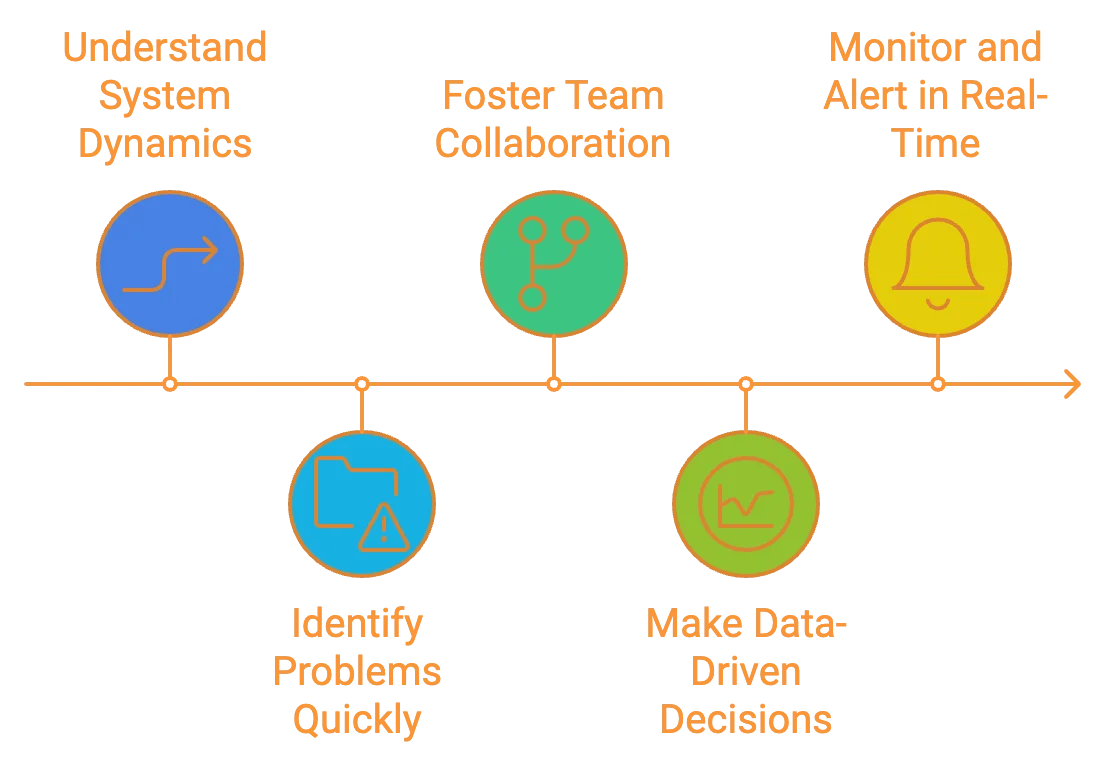
By transforming raw telemetry data into intuitive visual formats, OpenTelemetry visualization empowers you to maintain healthier, more efficient systems.
Key Components of OpenTelemetry Visualization
To effectively visualize OpenTelemetry data, you need to understand the key components involved:
- Data Collection and Instrumentation:
- OpenTelemetry SDKs: These libraries allow you to instrument your code, automatically collecting telemetry data from your applications.
- Auto-instrumentation agents: For supported languages, these can add telemetry without modifying your source code.
- OpenTelemetry Collector:
- Acts as a central hub for processing and exporting telemetry data
- Receives data from multiple sources
- Performs data transformation and filtering
- Exports data to various backends
- Backend Storage Solutions:
- Time-series databases (e.g., Prometheus, InfluxDB): Ideal for storing metrics
- Distributed tracing systems (e.g., Jaeger, Zipkin): Designed for storing and querying trace data
- Log management systems (e.g., Elasticsearch, Loki): Optimized for storing and searching log data
- Visualization Tools:
- Dashboarding platforms (e.g., SigNoz, Grafana, Kibana): Create custom visualizations and dashboards
- APM solutions (e.g., SigNoz, Datadog): Provide pre-built visualizations tailored for application performance monitoring
- Specialized tools (e.g., Jaeger UI for distributed tracing)
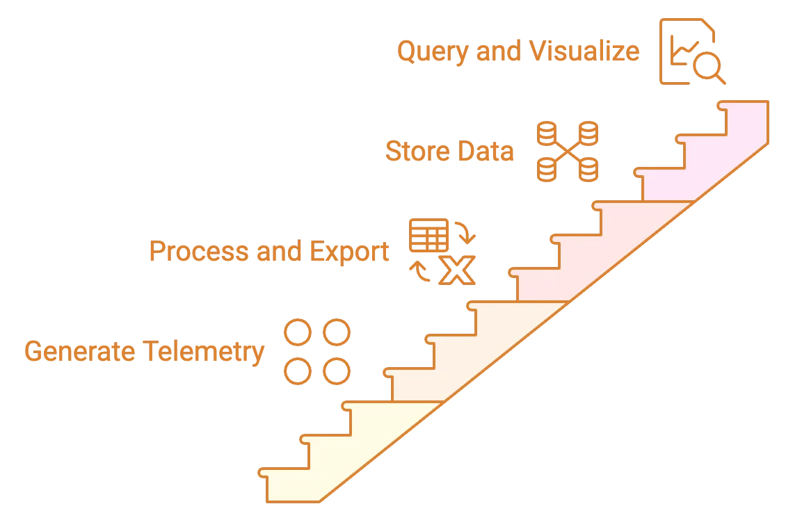
These components work together to create a complete OpenTelemetry visualization pipeline:
- Your instrumented applications generate telemetry data.
- The OpenTelemetry Collector receives, processes, and exports this data.
- Backend systems store the telemetry data efficiently.
- Visualization tools query the backend and create meaningful visual representations.
Choosing the Right OpenTelemetry Visualization Tool
Selecting the appropriate visualization tool is crucial for maximizing the value of your OpenTelemetry data. Consider these factors when making your choice:
- Scalability: Can the tool handle your current data volume? Will it grow with your needs?
- Data Retention: How long does the tool store historical data? Is this sufficient for your use cases?
- Query Language: Is the tool's query language powerful enough for your analysis needs? Is it easy for your team to learn and use?
- Support for OpenTelemetry Semantic Conventions: Does the tool understand and properly display OpenTelemetry's standardized attributes and metrics?
- Integration Capabilities: Can the tool easily connect with your existing infrastructure and other tools in your observability stack?
- User Interface and Customization: Is the interface intuitive? Can you create custom dashboards and visualizations to match your specific requirements?
- Cost: For commercial solutions, does the pricing model align with your budget and expected usage?
- Community and Support: For open-source options, is there an active community? For commercial tools, what level of support is provided?
Remember — there's no one-size-fits-all solution. The best tool depends on your specific needs, existing infrastructure, and team expertise.
Popular OpenTelemetry Visualization Tools
Let's explore some widely-used options for visualizing OpenTelemetry data:
Open-source Options
- SigNoz: An open-core, full-stack observability platform built natively for OpenTelemetry.
- Jaeger:
- Specializes in distributed tracing visualization
- Offers a powerful query language for trace analysis
- Provides service dependency graphs and flame graphs for performance insights
- Prometheus:
- Focuses on metrics collection and visualization
- Features a flexible query language (PromQL) for data analysis
- Includes a built-in alerting system
- Grafana:
- Creates highly customizable dashboards
- Supports multiple data sources, including Prometheus and Jaeger
- Offers a wide range of visualization types and plugins
Commercial Solutions
Several vendor-agnostic commercial options provide comprehensive OpenTelemetry visualization capabilities:
- Datadog: Offers extensive integrations and AI-powered analytics.
- New Relic: Provides a unified platform for metrics, traces, and logs.
- Honeycomb: Specializes in high-cardinality observability data.
Cloud providers also offer native observability solutions compatible with OpenTelemetry:
- Amazon CloudWatch
- Google Cloud Operations Suite
- Azure Monitor
These commercial options often provide additional features like advanced analytics, anomaly detection, and integrated incident management — but at a cost.
SigNoz - an Open Source APM Built Natively for OpenTelemetry
SigNoz is a full-stack open source APM built natively to support OpenTelemetry. It supports OpenTelemetry semantic conventions and provides visualization for all three distinct types of signals(log management is under active development) supported by OpenTelemetry.
It also provides advanced OpenTelemetry visualizations of trace aggregates which can be analyzed with a powerful set of filters.
SigNoz cloud is the easiest way to run SigNoz. Sign up for a free account and get 30 days of unlimited access to all features.
You can also install and self-host SigNoz yourself since it is open-source. With 19,000+ GitHub stars, open-source SigNoz is loved by developers. Find the instructions to self-host SigNoz.
It is easy to get started with SigNoz. It can be installed on macOS or Linux computers in just three steps by using a simple installation script.
The install script automatically installs Docker Engine on Linux. However, you must manually install Docker Engine on macOS before running the install script.
git clone -b main <https://github.com/SigNoz/signoz.git>
cd signoz/deploy/
./install.sh
You can visit our documentation for instructions on how to install SigNoz using Docker Swarm and Helm Charts.

You can then use Signoz to monitor application metrics with out-of-box charts and visualization.
Visualizing OpenTelemetry data with SigNoz
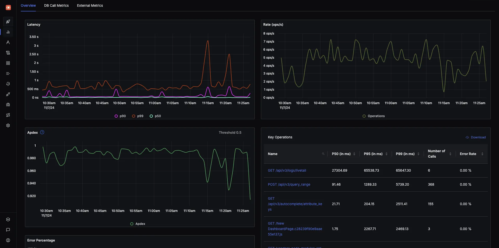
A sample application comes bundled with SigNoz to explore the dashboard capabilities. Let us see what kind of visualizations are possible with OpenTelemetry data.
Application Metrics
SigNoz comes with out-of-box charts for the popular RED(requests, error, and duration) metrics.
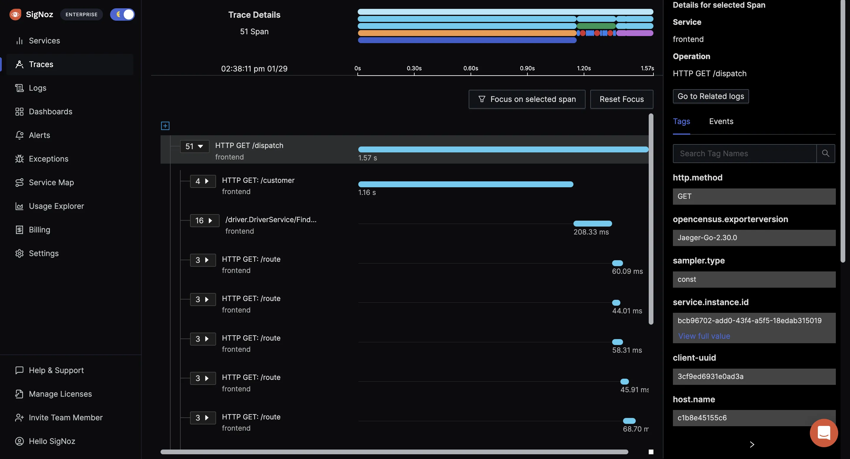
Distributed tracing with Flamegraphs and Gantt Charts
The tracing data captured with OpenTelemetry can be visualized with the help of Flamegraphs and Gantt charts. This view gives you a complete breakdown of a single user request as it travels across services and protocols.
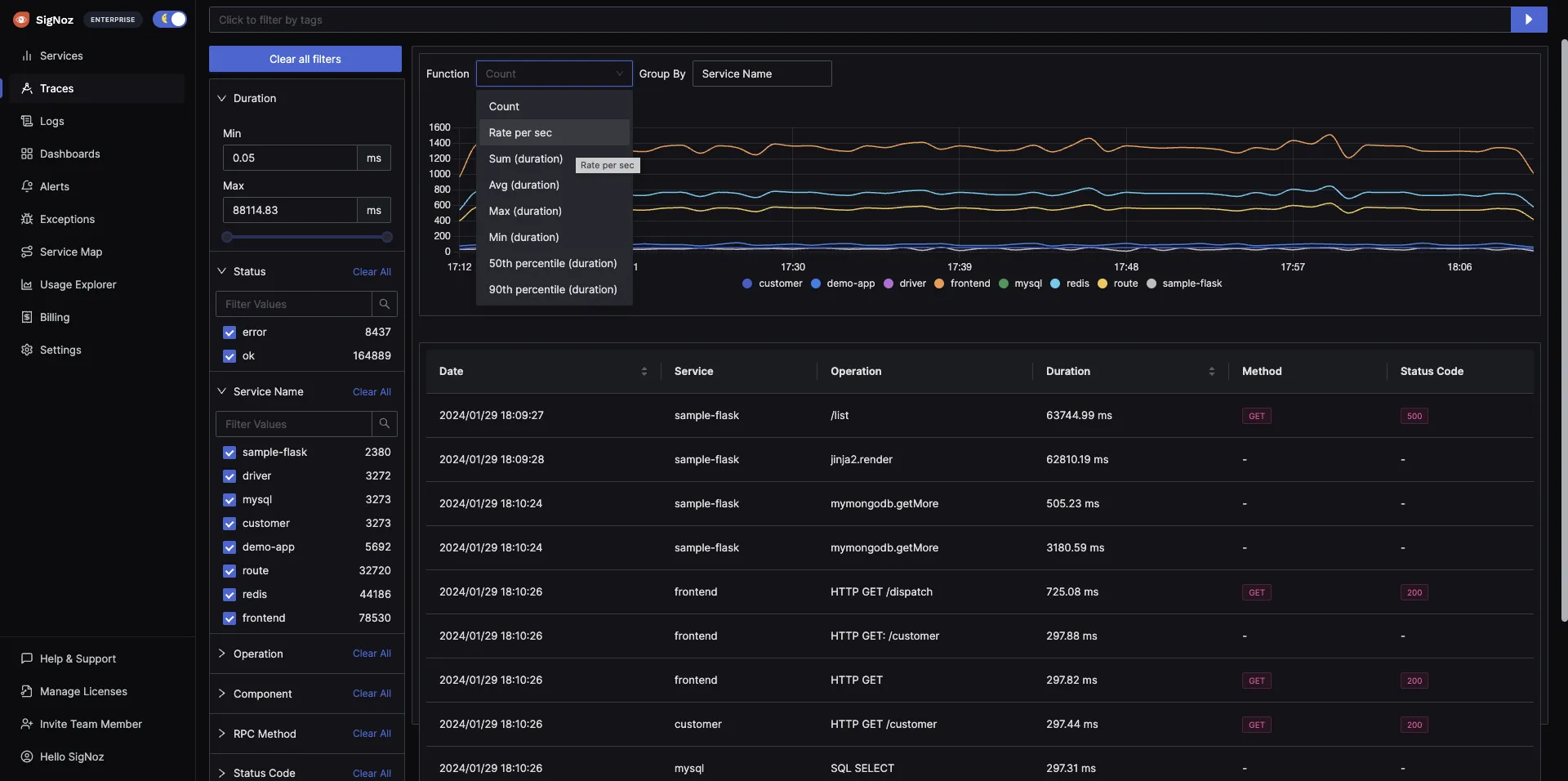
Trace aggregates
Using SigNoz dashboards, you can run and visualize aggregated trace data collected with OpenTelemetry. Create trace aggregates visualizations helps you create service-centric views. For example, you can see the P99 latency of all your services to pinpoint the one causing performance issues.
You can also analyze the trace data using a set of powerful filters like status, operation, HTTP codes, etc. SigNoz uses OpenTelemetry semantic conventions to visualize this data.
Custom Dashboards
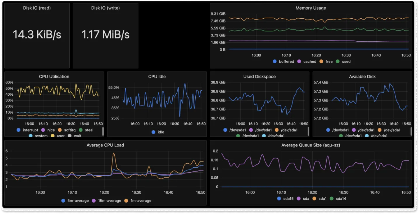
OpenTelemetry provides receivers for receiving metrics from metrics exporters of a lot of common technologies. For example, there are receivers for Redis, AWS container insights, Docker stats, etc. Using these receivers, you can build custom dashboards with SigNoz.
Getting Started with OpenTelemetry Visualization
To start with OpenTelemetry visualization, you first need to instrument your application code with OpenTelemetry client libraries. Opentelemetry also provides auto-instrumentation agents for some programming languages like Java. With auto-instrumentation, you can start to monitor your application with minimal code changes.
Below are the steps required to start with OpenTelemetry visualization:
- Instrument application code with language-specific OpenTelemetry libraries
- Configure OpenTelemetry Exporters to send data to SigNoz
- Visualize and analyze telemetry data using SigNoz dashboards
OpenTelemetry has language-specific instrumentation steps. You can explore our docs for specific instructions for different programming languages:
SigNoz cloud is the easiest way to run SigNoz. Sign up for a free account and get 30 days of unlimited access to all features.
You can also install and self-host SigNoz yourself since it is open-source. With 19,000+ GitHub stars, open-source SigNoz is loved by developers. Find the instructions to self-host SigNoz.
Best Practices for Effective OpenTelemetry Visualization
To get the most out of your OpenTelemetry visualizations, follow these best practices:
- Implement Consistent Naming Conventions and Tagging:
- Use clear, descriptive names for services, endpoints, and metrics
- Apply consistent tags to aid in filtering and grouping data
- Follow OpenTelemetry semantic conventions where applicable
- Design Informative and Actionable Dashboards:
- Create role-specific dashboards (e.g., for developers, operations, management)
- Use a logical layout that tells a story about your system's performance
- Include both high-level overviews and the ability to drill down into details
- Utilize Heat Maps and Service Dependency Graphs:
- Heat maps help identify patterns and anomalies in large datasets
- Service dependency graphs visualize the relationships between components in your system
- Correlate Metrics, Traces, and Logs:
- Link related data types for comprehensive analysis
- Use trace IDs to connect logs with specific request flows
- Combine metrics with traces to understand the impact of performance issues
- Implement Effective Alerting:
- Set up alerts based on key performance indicators (KPIs)
- Use dynamic thresholds to reduce noise and catch real issues
- Ensure alerts are actionable and provide context for troubleshooting
- Regularly Review and Refine Visualizations:
- Continuously improve your dashboards based on user feedback
- Remove unused or redundant visualizations to maintain clarity
- Update visualizations as your system evolves
By following these practices, you'll create OpenTelemetry visualizations that provide clear, actionable insights into your system's behavior.
Overcoming Common Challenges in OpenTelemetry Visualization
As you implement OpenTelemetry visualization, you may encounter several challenges. Here's how to address them:
- High-Cardinality Data:
- Problem: Too many unique values in your data can slow down queries and make visualizations cluttered.
- Solution: Use sampling techniques, implement data aggregation, and design your instrumentation to limit unnecessary high-cardinality fields.
- Data Volume and Retention:
- Problem: Storing and querying large volumes of telemetry data can be expensive and slow.
- Solution: Implement intelligent sampling, use efficient storage solutions (e.g., columnar databases), and set up appropriate data retention policies.
- Data Consistency Across Services:
- Problem: Inconsistent naming or tagging across different services can make it difficult to correlate data.
- Solution: Establish and enforce consistent naming conventions and tagging strategies across your organization.
- Security and Privacy Concerns:
- Problem: Telemetry data may contain sensitive information.
- Solution: Implement data masking, use encryption for data in transit and at rest, and ensure compliance with relevant data protection regulations.
- Tool Sprawl:
- Problem: Using multiple visualization tools can lead to fragmented insights and increased complexity.
- Solution: Aim for a consolidated observability platform that can handle metrics, traces, and logs in a unified interface.
- Alert Fatigue:
- Problem: Too many alerts can lead to important issues being overlooked.
- Solution: Use dynamic thresholds, implement alert grouping, and regularly review and refine your alerting rules.
By anticipating and addressing these challenges, you can create a more effective and sustainable OpenTelemetry visualization strategy.
Key Takeaways
- OpenTelemetry visualization transforms raw telemetry data into actionable insights, crucial for understanding and optimizing complex distributed systems.
- Effective visualization requires proper instrumentation, data processing, and choosing the right tools for your specific needs.
- Popular visualization options include open-source tools like SigNoz, Jaeger and Grafana, as well as commercial solutions like DataDog.
- Best practices include consistent naming conventions, correlating different types of telemetry data, and regularly refining your visualizations.
- Common challenges include dealing with high-cardinality data and managing large data volumes.
FAQs
What's the difference between OpenTelemetry and visualization tools?
OpenTelemetry is a framework for collecting and exporting telemetry data. Visualization tools take this data and create graphical representations. While OpenTelemetry standardizes data collection, visualization tools focus on presenting that data in meaningful ways.
Can OpenTelemetry data be visualized in real-time?
Yes, many visualization tools support real-time updates. This capability depends on your data pipeline's latency and the visualization tool's refresh rate.
How does OpenTelemetry visualization improve application performance?
Visualization helps you quickly identify performance bottlenecks, understand system dependencies, and spot anomalies. This insight allows you to make targeted improvements to your application's performance.
Is it possible to visualize OpenTelemetry data from multiple programming languages in a single dashboard?
Absolutely. OpenTelemetry's standardized approach ensures that data from different languages can be collected and visualized consistently. Most visualization tools can combine data from multiple sources into unified dashboards.
Further Reading
SigNoz - an open-source alternative to DataDog
OpenTelemetry Collector - a complete guide


